Overview: Beat is your new health & wellness HQ right in your iPhone. Now, being healthier, is now easier than ever. With Beat you'll achieve your workout goals quicker than ever thanks to essential in-app features like sleep tracking, special training sessions, and other overall health indicators.
Project Goals:
Training sessions in one spot: With beat, users now have at their fingertips a unique personal trainer who knows him better than the user itself with the power of data.
Your wellness hub: With data like sleep quality, respiratory rate or blood pressure any beat user has a unique competitive advantage when decide to workout. By knowing your body and your real health conditions users will be able to prevent injuries and enhance sports performance.
Clear information architecture to boost user experience: At beat I decided to create a clear architecture in order to ensure the user as the best possible user experience. Clear menus, clear information, clear tasks aiming to generate a gratifying user experience.
Research: The design of beeeat aims to tackle a problem in this market which is fragmentation: an app to track your sleep, other to train, other to get healthier food recipes and the list goes on. Our research, based on qualitative interviews, brought to light the following issues to tackle:
I use different apps for tracking sleep and nutrition, but the data feels scattered.
The problem isn't the features offered by wellness apps, but the actionable data. How can I effectively utilize the available information to improve my trainings?
I'm concerned about the storage and management of my health data.
Design Process:
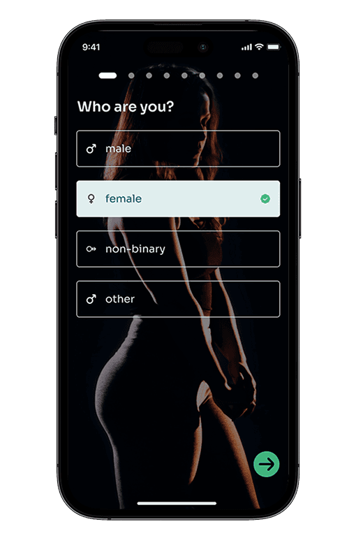
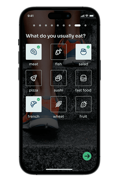
1. User-Centered Information Architecture: A user-centered information architecture was developed to clearly answer users' challenges launched in the research phase. I opted to create a clear IA in order to ensure the usage of the app is cristal clear for every user, from the younger and tech-savvy to elder people who still need to workout.
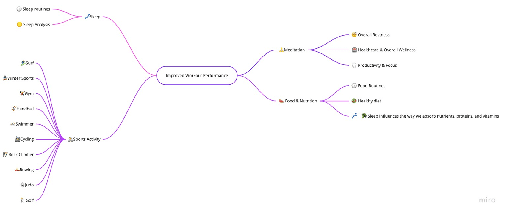
To make sure we answered users questions I've also developed a mindmap that allowed me to clearly highlight what would be the key-areas to tackle with the app to keep users training with beat and avoid the user churn which is typical in this type of digital product (~30%).
2. UI Design: With the user flows in place, the UI design phase began. I opted for a modern sans serif font and consistency in the iconography. The app, especially the home, was designed based on a modular view to make it easier to access the exercises.
3. User Testing and Iteration: Usability testing involved real users interacting with the product. Feedback indicated it was necessary to have a visual trigger to help the user evaluate the training session.
Results: beeeeat witnessed remarkable improvements:
10% Increase in Usability: The modular system revealed to be a complete success as the users reported was far easier to train with the modular system instead of a full screen approach (apple fitness+, nike, etc.).
Conclusion: The design of beeeat was one of the most important challenges I've ever faced as a UX/UI Designer. Not because of the app itself but the market landscape where's set to be launched. A product in a crowded market where differentiation is key to retain users where typically have high churn levels (>10% monthly). This case study underscores the important of designing for users if we're able to understand their pain points.